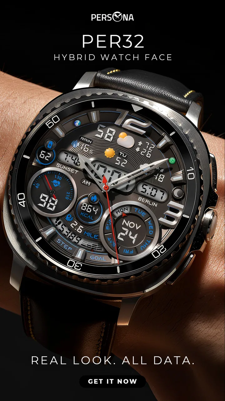
PER32 Ultra Hybrid Watch Face
- 4.1
- Rating
- 10.00K
- Installs
- $2.99
- Price
 Analysis by App-foxy
I approached PER32 Ultra Hybrid Watch Face as a practical personalization tool rather than a decorative download. The starting condition was familiar: my Wear OS watch worked perfectly, but its default face made everyday information feel scattered. I wanted a cleaner glance at the time without giving up the useful details that make a smartwatch different from a traditional watch. This app, developed by PERSONA Watch Face, is built around that exact tension. It combines a conventional-looking watch layout with digital information, so the result feels more like a hybrid instrument than a simple clock.
The app belongs to the personalization category, and its focus is narrow in a good way. It is not trying to become a complete smartwatch companion or a general customization suite. Instead, it gives the watch face itself the attention. That makes the decision fairly straightforward: if you want to change the visual and informational center of your Wear OS watch, this is relevant; if you are looking for a new productivity tool, it is not.
From a plain watch screen to a useful daily workflow
I find the move from a plain screen to a hybrid face most useful when I think about the small decisions a watch supports throughout the day, not just how it looks at rest. In this section, I’ll focus on how to make that change feel practical: what to notice during ordinary glances, and how to tell whether the layout is helping rather than simply adding decoration.
You May Also Like

 AccuWeather: Weather Radar
AccuWeather Review: A Quick, Clear Forecast for Everyday Decisions
For everyday plans, the best forecast is the one you can understand quickly. AccuWeather makes rain timing, radar, and local conditions easy to act on, with a few trade-offs.

 Hill Climb Racing
Why Hill Climb Racing Still Turns Crashes Into One More Run
A tiny car, a bumpy hill and one more upgrade: Hill Climb Racing keeps resurfacing because its simple chaos makes every near-miss feel personal.

 AliExpress - Shopping App
AliExpress Makes Global Shopping Feel Personal, but Shoppers Bear the Risk
AliExpress turns a global marketplace into a pocket-sized discovery engine. Its reach is useful, its shopping loop compelling, and its trade-offs easy to miss.

 Lords Mobile: Kingdom Wars
Lords Mobile Is a Kingdom-Building Routine, Not a Quick Match
A case-by-case verdict on the building, battles, device demands, and social commitments that make Lords Mobile rewarding for some players and exhausting for others.

 PDF Scanner app - TapScanner
TapScanner Makes Paperwork Easier to Capture, Check, and Share
TapScanner makes scanning with a phone feel less like a rescue operation and more like a dependable step in getting work done. Its capture tools are useful, though not flawless.

 Block Blast!
 Shows How Much a Puzzle Game Can Leave Out
A quiet grid game shows why puzzle players increasingly value instant clarity, repeatable skill and low-pressure play—and where the genre still needs to catch up.
More From Our News Desk
View All News


Starting with the right expectation
The first thing I would tell a friend is to judge this app as a watch-face purchase, not as a large application with many separate screens. The store summary describes it as a hybrid watch face for Wear OS, while the short description calls it Ultra Hybrid. Those words set the right expectation: the appeal is the combination of analog character and digital practicality, not a long list of unrelated functions.
That distinction matters because watch faces are unusually personal. Some people want the quietest possible display, with only hands and markers. Others want the screen to act as a dashboard. A hybrid design sits between those preferences. It preserves the immediate visual reading of an analog face while making room for digital information that can be understood with less interpretation. In my view, that makes it especially suitable for someone who likes the personality of a traditional dial but finds a purely analog face too limited during a busy day.
The app is priced at $2.99, which places it in the range where the decision depends more on fit than on experimentation. I would not buy it simply because the name sounds technical. I would buy it when the hybrid layout matches how I already use my watch. The purchase makes the most sense for a user who checks the wrist repeatedly for quick orientation and wants one face to remain useful across work, errands, and casual wear.
The setup flow and the first handoff
The practical workflow begins in the Wear OS environment: choose the face, apply it to the watch, and then live with the layout long enough to see whether it supports real habits. This handoff from the app listing to the watch is important. A watch face can look convincing in a preview and still feel awkward when viewed quickly while walking, carrying a bag, or standing in bright surroundings.
I recommend testing it first during the part of the day when you normally glance at your watch most often. For me, that would be moving between appointments, checking the time before leaving home, and looking down while my phone is out of reach. Those moments reveal whether the analog portion is readable at a glance and whether the digital elements are arranged in a way that avoids visual searching.
A useful approach is to resist changing every available appearance option immediately. Start with the default presentation, learn where your eyes naturally land, and only then adjust the look if the face allows it. This creates a cleaner comparison between the design itself and your personal styling preferences. It also prevents a common mistake with customizable watch faces: spending time making the screen attractive before discovering that the information hierarchy does not suit your routine.
How the hybrid idea works in everyday use
The central trade-off is between visual familiarity and information density. Analog hands give the time a shape that can be recognized almost instantly, especially for people who have spent years reading conventional watches. Digital elements, by contrast, are useful when exactness matters or when additional context is needed. Combining both can reduce the need to choose between elegance and utility.
In a realistic morning scenario, I could put on the watch while getting ready, read the approximate time from the hands while moving around, and then use the digital portion for a precise check before leaving. Later, during a short meeting, the analog display would let me glance down without making the watch feel like a miniature phone. On the way home, the same face would still look appropriate with casual clothing. That continuity is one of the strongest reasons to choose a hybrid design instead of switching between a formal face and a data-heavy face.
The important insight is that the face can serve different reading speeds. The analog layer works for recognition, while the digital layer works for confirmation. Those are not identical tasks. A face that handles both can be more useful than one that looks impressive in a static screenshot but forces you to decode every glance from scratch.
Handoffs between watch, phone, and personal habits
A watch face does not exist in isolation. Its success depends on a handoff between the design, the watch hardware, and the user’s behavior. The watch supplies the screen and Wear OS environment; the face supplies the arrangement; I supply the decision about what deserves attention. If those three parts agree, the experience feels effortless. If they do not, even a polished design becomes something I keep replacing.
This is where PER32 Ultra Hybrid Watch Face has a clear identity. It is intended for the watch itself, so the value appears during repeated micro-interactions rather than in a long session inside the app. I would not expect it to replace phone-based customization or provide a separate destination for browsing. Its job is completed when the selected face is visible, readable, and comfortable enough to leave in place.
For someone who changes watch faces every few days, that may feel too restrained. For someone who wants to settle on one dependable face, the focused approach is more appealing. The best workflow is to treat installation as the beginning of a short observation period: notice where your eyes go, which parts you ignore, and whether the face still feels comfortable after the novelty fades.
Where the design is strongest
Its strongest idea is balance. A purely digital face can look efficient but sometimes loses the visual calm of a watch. A purely analog face can look excellent but may not satisfy someone who wants more information at a glance. The hybrid direction gives the user a middle ground without requiring two separate identities for the same device.
I also like the fact that this kind of design can make a smartwatch feel less disposable. Many Wear OS faces lean heavily into futuristic panels, bright colors, or dense technical displays. Those styles can be fun, but they may clash with work clothes or become tiring after prolonged use. A hybrid face has a better chance of fitting into different parts of the day because its visual language is not tied to one particular setting.
That does not mean it will suit everybody. If your priority is maximum minimalism, any added digital detail may feel like clutter. If your priority is seeing as many pieces of information as possible, a specialized dashboard-style face may be more efficient. The strength here is not absolute superiority; it is the compromise.
Small workflow improvements that make a difference
One practical tip is to evaluate readability while your wrist is in motion, not only when your arm is held perfectly still. A face that works on a desk can feel less successful when checked while walking. I would also test it with the watch at the angle I naturally use, because a design that requires deliberate positioning adds friction to every glance.
A second tip is to decide what “quick information” means for you before settling on the face. If your main need is precise timekeeping, the digital component should support the hands rather than compete with them. If your main need is a broader dashboard, you may find the hybrid approach less satisfying than a face designed around data first. This simple self-check prevents buying based only on appearance.
A third useful habit is to keep the face unchanged for a normal working day before judging it. Frequent switching makes every design feel fresh and makes it difficult to identify which one actually reduces effort. The outcome I want from a watch face is not admiration after installation; it is fewer moments of hesitation when I look down.
Who will appreciate the result
I see this app working best for Wear OS owners who want a face with character but do not want to sacrifice practical reading. It should appeal to people moving between casual and professional settings, because the hybrid concept is less narrowly styled than an aggressively sporty or purely technical display. It is also a reasonable choice for anyone who has tried minimalist faces and found them too bare, yet has rejected dense faces as visually exhausting.
The age rating is Everyone, so the product is presented as suitable for a broad audience. In practical terms, the more important question is visual preference and watch usage. A teenager who wants a bold animated look may prefer something else, while an adult who wants a dependable everyday face may find the restrained hybrid approach more convincing.
The app has an average rating of 4.1 from around 500 ratings, with several dozen written reviews, and it has passed the ten-thousand-install mark. Those figures suggest that it has attracted a real audience, but I would still treat them as context rather than a substitute for personal fit. Watch-face satisfaction is especially subjective: a layout that feels perfectly balanced to one person can feel crowded or old-fashioned to another.
Where the workflow breaks down
The first possible break occurs at the point of visual density. Hybrid means compromise, and compromise can become clutter if too much is competing for attention. Someone who wants one large time display and nothing else may find the additional information distracting. The face may also be a poor match for users who select watch faces primarily for novelty, animation, or dramatic visual effects.
The second break is expectation management. Because this is a personalization app, the meaningful outcome is the watch display, not a rich app experience on the phone. If you expect a broad collection of tools, extensive phone interaction, or a replacement for other Wear OS functions, the purchase will probably feel too narrow. The focused scope is a benefit only when that is what you want.
The third break is the price-to-use relationship. $2.99 is modest for a face you will wear every day, but it is not automatically good value if you change faces constantly. I would skip it if I know I will return to a free favorite after a few hours. I would consider it worthwhile if the design becomes the face I leave installed for ordinary workdays and weekends.
There is also a personal-style limitation. A hybrid face may look polished in one color treatment or clothing context and less convincing in another. That is not a flaw unique to this app, but it is a reason to think about wardrobe, watch case, and typical lighting before committing. A face that fits only formal occasions has less practical value than one that remains comfortable across the week.
How it compares with the usual alternatives
Compared with a basic analog face, this app offers a more informative starting point. The benefit is not that analog faces are outdated; it is that the hybrid arrangement can reduce the need to open another screen for a precise check. The cost is a busier visual field and potentially less of the quiet simplicity that makes a basic dial attractive.
Compared with a fully digital face, the advantage is personality and immediate visual orientation. Digital faces often win when exact numbers and compact data are the only priorities. PER32 Ultra Hybrid Watch Face is more appropriate when I want the watch to retain the emotional feel of a watch while still behaving like a modern wearable.
Compared with a heavily customized dashboard face, the hybrid approach is likely to be easier to live with for someone who values balance over maximum information. A dashboard can be better for users who monitor several details repeatedly. This face is better for the person who wants the time to remain the dominant message and supporting information to stay within the same glance.
That comparison also clarifies who should skip it. If you already have a free face that gives you exactly the information you need and you do not care about a different visual identity, there is little reason to pay for a change. If you want a highly animated or data-first experience, choose a face designed around that purpose instead. This app earns its place when the hybrid compromise is itself the feature you have been missing.
The final outcome after the full workflow
After moving from a plain or unsatisfying watch display to a hybrid layout, the result I would look for is not a dramatic transformation. It is a quieter improvement: the watch feels more intentional, the time can be read in more than one way, and the same face remains appropriate in several daily situations. That kind of benefit is easy to underestimate because it appears in brief moments rather than long sessions.
My overall opinion is positive, with a clear condition attached. PER32 Ultra Hybrid Watch Face is a sensible paid personalization choice for Wear OS users who want analog familiarity and digital convenience in one presentation. The developer, PERSONA Watch Face, has chosen a focused concept rather than trying to make the product do everything, and that focus helps the identity remain clear.
I would recommend it to a friend who keeps changing between overly plain analog faces and overly busy digital ones. I would explain that the value comes from finding a comfortable middle ground, then leaving it installed long enough to judge the workflow honestly. I would not recommend it to someone seeking a free, endlessly changing collection or a face built primarily for maximum data density.
In the end, the purchase makes sense when you want your smartwatch to feel more like a personal everyday watch and less like a tiny control panel. The strongest outcome is a face that supports quick glances without demanding attention. For that specific goal, PER32 Ultra Hybrid Watch Face is a focused and worthwhile option, provided its balanced layout matches the way you actually read your watch.
FAQs for PER32 Ultra Hybrid Watch Face
01What is PER32 Ultra Hybrid Watch Face?
PER32 Ultra Hybrid Watch Face is a customizable watch face designed for compatible Wear OS smartwatches. It combines an analog-style display with digital information, giving the screen a more traditional appearance while still showing useful details such as the time, date, battery level, and other supported indicators. Its overall design is aimed at users who want a detailed, modern, and practical watch face rather than a basic clock.
02Which smartwatches are compatible with PER32 Ultra Hybrid Watch Face?
Compatibility depends on the Wear OS version and the smartwatch model you use. PER32 Ultra Hybrid Watch Face is intended for supported Wear OS devices, but not every watch offers exactly the same features, complications, or customization options. Before downloading, check the listing in Google Play and confirm that your particular watch model is supported. Features may also vary between newer and older Wear OS versions.
03Can I customize the PER32 Ultra Hybrid Watch Face?
Yes, the watch face is designed to provide customization through the watch face settings available on your Wear OS device. Depending on the model and software version, you may be able to change colors, select different display elements, adjust complications, or configure the information shown on the screen. The available options can differ by device, so some settings may not appear on every compatible smartwatch.
04Does PER32 Ultra Hybrid Watch Face affect battery life?
Like any active watch face, PER32 Ultra Hybrid Watch Face can have some effect on battery consumption, especially when it uses bright colors, animated elements, frequent updates, or complications that access sensors and data. In normal use, the impact should depend largely on your smartwatch hardware and settings. Choosing a simpler design, reducing brightness, and limiting unnecessary complications may help extend battery life.
05How do I install and use PER32 Ultra Hybrid Watch Face?
Install PER32 Ultra Hybrid Watch Face through the official Google Play listing on your phone or compatible Wear OS smartwatch. After installation, open the watch face selector on the watch, find PER32 Ultra Hybrid, and apply it. You can then open its customization settings to adjust the appearance and information fields. If it does not appear immediately, check that the watch is connected, synchronized, and running supported software.
Pros
- Combines digital and analog elements for quick
- flexible time reading.
- Offers a sporty hybrid look that suits both casual and active outfits.
- Includes useful at-a-glance data such as date
- battery
- and activity details.
- Designed to make good use of limited smartwatch display space.
- Works well as an everyday face without overwhelming the screen.
Cons
- Some complications may depend on the smartwatch model or Wear OS support.
- The information-dense layout can feel crowded on smaller displays.
- Customization options may be less extensive than premium watch faces.
- Bright elements can be distracting or affect battery life on some devices.
- Its sporty aesthetic may not appeal to users seeking a classic watch design.

PER32 Ultra Hybrid Watch Face
Gallery